Note: This article is from 2012. Many of these websites have likely been updated or may no longer exist. This serves as a historical reference for web design practices of that era.
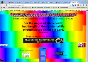
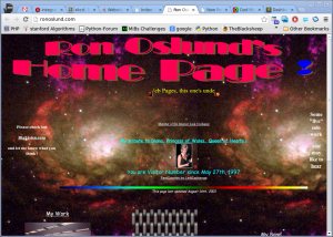
Here are some screenshots of the worst websites I have ever seen. Most of them use too many colors, have moving elements, or use black backgrounds. One uses frames (which were already outdated by 2012).


Do you know similar examples of bad website designs?
What Makes a Website Design "Bad"?
Looking at these examples from 2012, we can identify common problems:
- Too many colors: Overwhelming color schemes that hurt readability
- Moving elements: Distracting animations and scrolling text
- Poor contrast: Dark backgrounds with poor text visibility
- Outdated technology: Using frames and other deprecated HTML features
- Information overload: Cramming too much content without proper organization
- Inconsistent navigation: Making it hard for users to find what they need
Modern web design has evolved significantly since 2012, emphasizing: - Clean, minimalist designs - Mobile responsiveness - Accessibility standards - Fast loading times - User-centered design principles