I guess many of you might need to plot functions or data once. So I've made one example that shows much of the features you might need:
- You can see how to change the axis' from normal linear scale to logarithmic scale.
- Some axis-manipulations were used.
- I have used a CSV-file to import and plot data.
- The red line was drawn with a mathematical function.
Best of all: I didn't use anything which is not in LaTeX ☺ (Well, the generation of the CSV-file doesn't count. I just wanted to include such an example for physicists who might need to plot results of experiments).
The complete source is in the Birthday Paradox Archive.
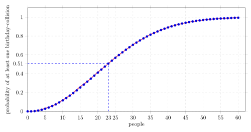
Result
LaTeX-Code
The following LaTeX-Code used TikZ and PGFplots:
% Plot of the probability that two people out of n people have the
% same birthday.
% Author: Martin Thoma
% Source: ../plotting-graphs-with-pgfplots/

\documentclass{article}
\usepackage[pdftex,active,tightpage]{preview}
\setlength\PreviewBorder{2mm}

\usepackage{pgfplots}
\usepackage{tikz}
\usetikzlibrary{arrows, positioning, calc}

\begin{document}
\begin{preview}
\begin{tikzpicture}
    \begin{axis}[
        width=15cm, height=8cm,     % size of the image
        grid = major,
        grid style={dashed, gray!30},
        %xmode=log,log basis x=10,
        %ymode=log,log basis y=10,
        xmin=0,     % start the diagram at this x-coordinate
        xmax=62,    % end   the diagram at this x-coordinate
        ymin=0,     % start the diagram at this y-coordinate
        ymax=1.1,   % end   the diagram at this y-coordinate
        /pgfplots/xtick={0,5,...,60}, % make steps of length 5
        extra x ticks={23},
        extra y ticks={0.507297},
        axis background/.style={fill=white},
        ylabel=probability of at least one birthday-collision,
        xlabel=people,
        tick align=outside]

      % import the correct data from a CSV file
      \addplot table [id=exp]{data.csv};

      % mark x=23
      \coordinate (a) at (axis cs:23,0.507297);
      \draw[blue, dashed, thick](a -| current plot begin) -- (a);
      \draw[blue, dashed, thick](a |- current plot begin) -- (a);

      % plot the stirling-formulae
      \addplot[domain=0:60, red, thick]
        {1-(365/(365-x))^(365.5-x)*e^(-x)};
    \end{axis}
\end{tikzpicture}
\end{preview}
\end{document}
I generate the images directly with this Makefile:
SOURCE = birthday-paradox
DELAY = 80
DENSITY = 300
WIDTH = 500

make:
    pdflatex $(SOURCE).tex -output-format=pdf
    make clean

clean:
    rm -rf  $(TARGET) *.class *.html *.log *.aux

gif:
    pdfcrop $(SOURCE).pdf
    convert -verbose -delay $(DELAY) -loop 0 -density $(DENSITY) $(SOURCE)-crop.pdf $(SOURCE).gif
    make clean

png:
    make
    make svg
    inkscape $(SOURCE).svg -w $(WIDTH) --export-png=$(SOURCE).png

transparentGif:
    convert $(SOURCE).pdf -transparent white result.gif
    make clean

svg:
    #inkscape $(SOURCE).pdf --export-plain-svg=$(SOURCE).svg
    pdf2svg $(SOURCE).pdf $(SOURCE).svg
    # Necessary, as pdf2svg does not always create valid svgs:
    inkscape $(SOURCE).svg --export-plain-svg=$(SOURCE).svg