This Review gives an overview of interesting stuff I stumbled over which is related to machine learning.
New Developments
- KittiSeg (reddit): A toolkit for semantic segmentation based on TensorVision
- AudioSet: A dataset for acoustic events
Publications
- Evolution Strategies as a Scalable Alternative to Reinforcement Learning
- Controllable Text Generation
- Stopping GAN Violence: Generative Unadversarial Networks: Probably one of the funniest ML things I've seen so far. Reminds me of Machine Learning A Cappella - Overfitting Thriller
- Deep Neural Networks Do Not Recognize Negative Images
- Twitter100k: A Real-world Dataset for Weakly Supervised Cross-Media Retrieval
- MINC-2500 dataset
- Second-order Convolutional Neural Networks
Software
Interesting Questions
- How to predict an item's category given its name?
- How do you share models?
- How many FLOPs does tanh need?
Miscellaneous
Color Maps
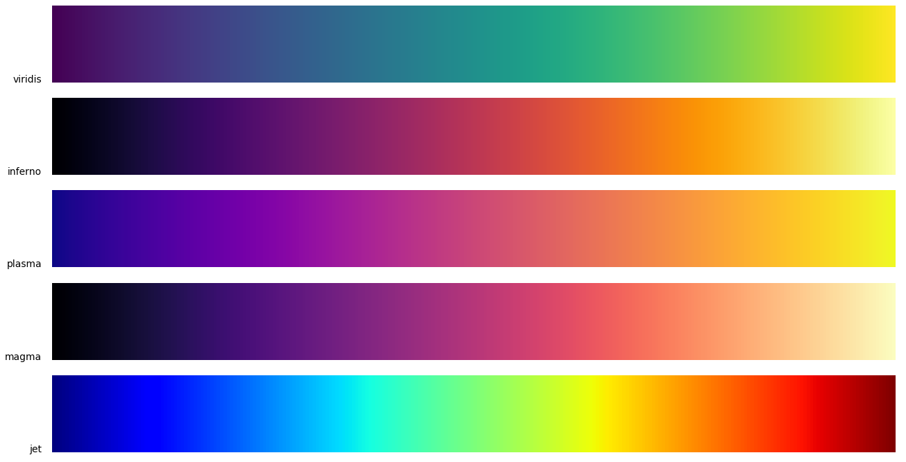
Color Maps are important for visualizing data. But the default color map for many applications is jet, which is bad for several reasons:
- It's hard to estimate distances from jet
- Doesn't work well when printed in grayscale
- Even worse if you are colorblind
The YouTube clip A Better Default Colormap for Matplotlib
by Nathaniel Smith and Stéfan van der Walt gives a short introduction into
color theory. They introduce colorspacious
and viscm. viscm is a tool for
creating new color maps. They created viridis as a better alternative to
jet.
A blog post with roughly the same content is at bids.github.io/colormap. This is the default for matplotlib 2.0. If you wonder which matplotlib version you have:
$ python -c "import matplotlib;print(matplotlib.__version__)"
That is how you update matplotlib:
$ sudo -H pip install matplotlib --upgrade
Here is a list of other matplotlib colormaps:
['Accent', 'afmhot', 'autumn', 'binary', 'Blues', 'bone', 'BrBG', 'brg',
'BuGn', 'BuP', 'bwr', 'CMRmap', 'cool', 'coolwarm', 'copper', 'cubehelix',
'Dark2', 'flag', 'gist_earth', 'gist_gray', 'gist_heat', 'gist_ncar',
'gist_rainbow', 'gist_stern', 'gist_yarg', 'GnB', 'gnuplot', 'gnuplot2',
'gray', 'Greens', 'Greys', 'hot', 'hsv', 'jet', 'nipy_spectral', 'ocean',
'Oranges', 'OrRd', 'Paired', 'Pastel1', 'Pastel2', 'pink', 'PiYG', 'PRGn',
'prism', 'PuB', 'PuBuGn', 'PuOr', 'PuRd', 'Purples', 'rainbow', 'RdB', 'RdGy',
'RdP', 'RdYlB', 'RdYlGn', 'Reds', 'seismic', 'Set1', 'Set2', 'Set3',
'Spectral', 'spectral', 'spring', 'summer', 'terrain', 'Vega10', 'Vega20',
'Vega20b', 'Vega20c', 'winter', 'Wistia', 'YlGn', 'YlGnB', 'YlOrBr', 'YlOrRd']
Finally, some interesting links:
Class distribution
You should always know if your data is severely unevenly distributed. Here is a little script to visualize the data distribution:
import matplotlib.pyplot as plt

data = y.flatten()  # your labels
plt.hist(data, bins=np.arange(data.min(), data.max() + 2))  # yes, +2.
plt.show()
or
import seaborn as sns

data = y.flatten()  # your labels
sns.distplot(data)
sns.plt.show()
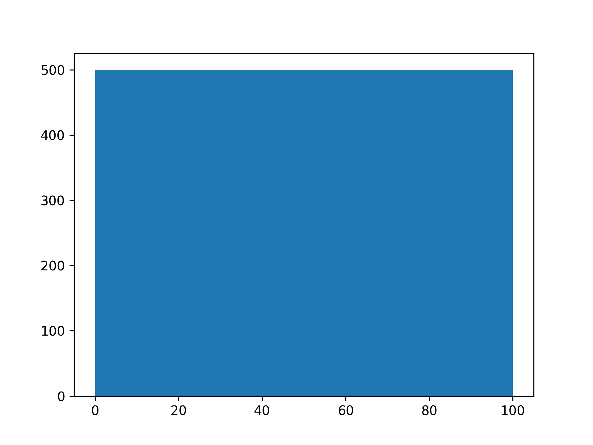
For the CIFAR100 training data, this is pretty boring: